2017 Gear
Comments
-
Depends who holds the upper hand in that negotiation. In this case I'd argue that Astana have the money and they get to pick who provides their bikes rather than the other way around. Argon 18 are lucky they get into the WT given that Bora dropped them for Sagan...
So quite right that Astana want their national colours and def no soviet red...") 0
0 -
Richmond Racer 2 wrote:yourpaceormine wrote:The Astana kit is much nicer with the black shorts. At first I did wonder if the yellow bands were still some tie in to Livewrong and the Tedious Texan (but that was ages ago); I'm sure even with their darker bits of 'history' Astana are keen to distance themselves from that period.
Many many dark moments from their history to choose from, mind
Lovely, weren't they?
 seanoconn - gruagach craic!0
 -
stunning new bikes, far better than those shitty Specialized0
-
^fair play, that's pretty nice (at least to this luddite, as far as modern bikes go)It's only a bit of sport, Mun. Relax and enjoy the racing.0
-
Is that a full FSA groupo? I knew they were trailing the prototype last season.0
-
-
-
fundacontador team bike0
-
Christ those bikes don't get any better looking0
-
And a Rotor full groupo. Be interesting to see if they're still riding it in races.0
-
kleinstroker wrote:fundacontador team bike
That's pretty depressing. Suspended sentence at least.It's only a bit of sport, Mun. Relax and enjoy the racing.0 -
FdJ new woman's team kit
 0
0 -
Salsiccia1 wrote:kleinstroker wrote:fundacontador team bike
That's pretty depressing. Suspended sentence at least.
Take another look at the Argon stem/stack arrangement and tell me the Look is somehow less elegant/aero...Half man, Half bike0 -
kleinstroker wrote:stunning new bikes, far better than those sh!tty Specialized
I like Argon 18 bikes and I like this colour scheme.
If I'm being picky, that would look better with slightly shallower rims.0 -
-
Cyclists are basically pretty conservative.Rick Chasey wrote:People basically like the argon 'cos it's a classic shape with (relatively) thin tubes.0 -
Rick Chasey wrote:People basically like the argon 'cos it's a classic shape with (relatively) thin tubes.
Yep. But I think bike design reached its pinnacle in the Colnago Master with C Record Deltas It's only a bit of sport, Mun. Relax and enjoy the racing.0 -
I know Deltas are 'the' brakes (I even had a Colnago with Deltas) but I've never really liked them aesthetically.0
-
Well not that many 20 somethings are able to spend 6 grand plus on a bicycle. Hence the views expressed tend to skew older.PTP Champion 2019, 2022 & 20230
-
Well I always disliked those bent upwards top tubes of Speshs and othersRick Chasey wrote:People basically like the argon 'cos it's a classic shape with (relatively) thin tubes.0 -
I see Louis Vuitton are in talks to buy Rapha. Seeing as they have bought Pinarello (or are in the process of buying them) I would not be surprised to see Pinarello& Rapha being a double header for future sponsorship deals (assuming the Rapha deal goes through). Sky in Rapha again once the Castelli deal is up?0
-
 http://www.snookcycling.wordpress.com - Reports on Cingles du Mont Ventoux, Alpe D'Huez, Galibier, Izoard, Tourmalet, Paris-Roubaix Sportive & Tour of Flanders Sportive, Amstel Gold Xperience, Vosges, C2C, WOTR routes....0
 -
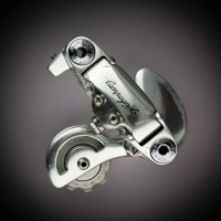
What's with that strange, oversized rear mech?!seanoconn - gruagach craic!0
-
-
M.R.M. wrote:That is the oversized pulley from Ceramic Speed.
Oh yes, that eye watering expensive addition that will save you 0.0003 nano watts of energy.
I think i'll eat an extra Kola bottle instead.seanoconn - gruagach craic!0 -
durhamwasp wrote:
Absolute rip-off of Team Wiggins and Rapha
Target motif, colours, even the bloody typeface0 -
Richmond Racer 2 wrote:durhamwasp wrote:
Absolute rip-off of Team Wiggins and Rapha
Target motif, colours, even the bloody typeface
A tad sensitive RR... agree on the similarity of the target motif and colours... but red and white are the country's colours. And to nitpick, the typeface is clearly not the same... look at the I...0 -
dish_dash wrote:Richmond Racer 2 wrote:durhamwasp wrote:
Absolute rip-off of Team Wiggins and Rapha
Target motif, colours, even the bloody typeface
A tad sensitive RR... agree on the similarity of the target motif and colours... but red and white are the country's colours. And to nitpick, the typeface is clearly not the same... look at the I...
Nah, its ripped off, Dish
Presumably the red represents the blood-letting of anyone who has been deemed a dissenter or opponent0 -
Richmond Racer 2 wrote:dish_dash wrote:Richmond Racer 2 wrote:durhamwasp wrote:
Absolute rip-off of Team Wiggins and Rapha
Target motif, colours, even the bloody typeface
A tad sensitive RR... agree on the similarity of the target motif and colours... but red and white are the country's colours. And to nitpick, the typeface is clearly not the same... look at the I...
Nah, its ripped off, Dish
Presumably the red represents the blood-letting of anyone who has been deemed a dissenter or opponent
Let's face it, the Wiggins logo or colour scheme is hardly original either... 0