2014 Gear
Comments
-
Astana BePink
 0
0 -
ad_snow wrote:
FFS.gpreeves wrote:Trek kit:
Pin stripe is nice, they should have kept it going on the black sleeve. Nice idea but not quite right IMO
The shorts look like they have a big inner tube patch stuck on them. They could have been more subtle.
No problems with a black bike always looks good IMO.0 -
More Garmin Sharp Poc gear pics, with specs too:
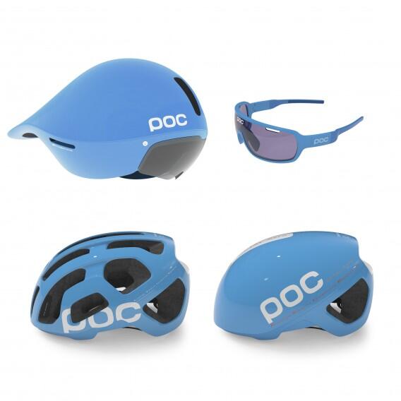 0
0 -
Sonny73 wrote:More Garmin Sharp Poc gear pics, with specs too:

Greasedscotsman is going to LOVE this pic 0
0 -
Richmond Racer wrote:Greasedscotsman is going to LOVE this pic

You're not wrong!
(Actually, I don't like the specs very much, but then I'm too much of an Oakley tart to like anything else...)0 -
That Trek kit is awful.
So bland.0 -
greasedscotsman will soon be looking like this when hitting the roads.

 0
0 -
Do they now its 2014 and not the late 80s?0
-
Bit of an anticlimax, I thought they might go with the blue/orange combo they used on the tour bikes. That was quite nice (If they used black components like the seatpin, stem etc rather than frame coloured)gpreeves wrote:Trek kit: 0
0 -
I like the poc road helmet, but the other two are rubbish.
If you can't distinguish between OPQS, Trek and Sky you have terrible eyesight, or are stupid.0 -
Is POC Swedish for puke?0
-
Imagine that pale blue POC TT helmet with the pale blue Trek bikes of last years tour... It would be Playmobile goes to the races.Warning No formatter is installed for the format0
-
Protoype of the POC.
No no, wait.. I'ts the actual thing.. 0
0 -
-
Yep. Rabo gone. Euskaltel gone. I'm starting to appreciate Lampre (although they have the colours of the Olympic hockey pitch, which is nice).Rick Chasey wrote:Far too many dark kits.
And good on Lotto for bucking the trend.Twitter: @RichN950 -
Rick Chasey wrote:Far too many dark kits.
Well, really only 3 blackish kits and one dark blue. Out of 18. That's not really predominant is it? And out of those, only Trek is super bland. The others are still quite distinguishable.0 -
Aw I really like the new Trek kit. It's no original Leopard Trek but still think it's clean and simple (good in my book). Something that I would actually wear out on ride.0
-
 “New York has the haircuts, London has the trousers, but Belfast has the reason!0
 -
0
-
Unless that POC time trial helmet will save something in the region of twenty seconds per kilometre, it should be left on the team bus for every time trial. That aero road helmet looks like it will do the trick just fine while still allowing the rider to maintain his dignity.
The Trek jersey is not that bad. The pin stripes will barely be visible on TV although a little colour somewhere would have been nice. As long as they don't bring back those horrendous turquoise bikes (or whatever colour they were) things will be fine!
DD.0 -
You cant help but get excited with this champion.

Interim jersey for Tinkoff Saxo: Contador is the Greatest0
 -


 Contador is the Greatest0
 -

Good video of riders speaking about the Trek project:
http://www.youtube.com/watch?v=RnbpEm09gls
Nat Champs:

Frank Schleck looking in superb form btw.Contador is the Greatest0 -
That kit is all levels of wrong. It manages to make even the most waif like of riders look podgy and lumpy and the jerseys are horribly short or the bibs horribly low. There's nothing worse than jersey-bib gap.Correlation is not causation.0
-
I like the national champs jerseys but that panel on the shorts is a bit cack0
-
Another black jersey! Prefer it to some of them though.frenchfighter wrote:You cant help but get excited with this champion.
Interim jersey for Tinkoff Saxo: 0
0 -
It is just the jersey they are training in prior to their presentation.Contador is the Greatest0
-
25th anniversary shirt of Anny Hampsten's Gavia victory:
http://redkiteprayer.com/store/#!/~/pro ... d=30892560
Story:
http://redkiteprayer.com/2013/12/the-ha ... via-shirt/Contador is the Greatest0 -
Above The Cows wrote:That kit is all levels of wrong. It manages to make even the most waif like of riders look podgy and lumpy and the jerseys are horribly short or the bibs horribly low. There's nothing worse than jersey-bib gap.
yeah I agree. Pinstriped lycra isn't very flattering!0

