2014 Gear
Comments
-
Going from looking like a German Rutger Hauer circa Blade Runner to Bruce the poorly dressed triathlete. Not liking the vests at all.0
-
ThomThom wrote:frenchfighter wrote:This is how to do it:

Cool mofo.
Agreed. The kit is superb as well.0 -
0
-

Anyone for a game of Ozzie Rules?Correlation is not causation.0 -
TMR wrote:
More worried about the guy in the background with what looks like reverse tan lines...0 -
Sunbathing with his arm warmers on?or a shadow?I'm left handed, if that matters.0
-
Crampeur wrote:More worried about the guy in the background with what looks like reverse tan lines...
Isn't he the Russian guy from American Flyers?0 -
No, he signed for Katusha (obviously)greasedscotsman wrote:Crampeur wrote:More worried about the guy in the background with what looks like reverse tan lines...
Isn't he the Russian guy from American Flyers? Twitter: @RichN950
 -
TMR wrote:
I think it's the way that the black stripes near the neck look just a tiny bit like an undone bow tie, which with the vest combo ends up looking like a male stripper.Warning No formatter is installed for the format0 -
 “New York has the haircuts, London has the trousers, but Belfast has the reason!0
 -
TMR wrote:
Using the term 'gay' in a derogatory sense (and compounding it with a 'sadface') isn't really acceptable, is it?0 -
Crankbrother wrote:TMR wrote:
Using the term 'gay' in a derogatory sense (and compounding it with a 'sadface') isn't really acceptable, is it?
It isn't at all, it is something we see all to often on these forums.0 -
The image is too big, don't know how to fix it but here is Phinney testing a new Fizik tt saddle: https://www.facebook.com/photo.php?fbid ... =1&theater0
-
Nice blog post comparing the 2014 kits with last season's:
http://speedmetalpodcast.blogspot.co.uk/2014/01/2014-vs-2013-kits.html
The guy who does this blog is the brother of the Cycling Inquisitions blogger.0 -
Crankbrother wrote:TMR wrote:
Using the term 'gay' in a derogatory sense (and compounding it with a 'sadface') isn't really acceptable, is it?
It's a bit of a cunt's trick, to be fair.Ben
Bikes: Donhou DSS4 Custom | Condor Italia RC | Gios Megalite | Dolan Preffisio | Giant Bowery '76
Instagram: https://www.instagram.com/ben_h_ppcc/
Flickr: https://www.flickr.com/photos/143173475@N05/0 -
Art Vandelay wrote:Nice blog post comparing the 2014 kits with last season's:
http://speedmetalpodcast.blogspot.co.uk/2014/01/2014-vs-2013-kits.html
The guy who does this blog is the brother of the Cycling Inquisitions blogger.
Don't like his writing style at all, surely if you're going to write a blog you can come up with something more inventive to say rather than "shitty".0 -
Crankbrother wrote:TMR wrote:
Using the term 'gay' in a derogatory sense (and compounding it with a 'sadface') isn't really acceptable, is it?
Well said.0 -
I do like a personalised bit of kitTailWindHome wrote: 0
0 -
Stylish kit and bike. Not sure why he has a jersey and a skinsuit on though....

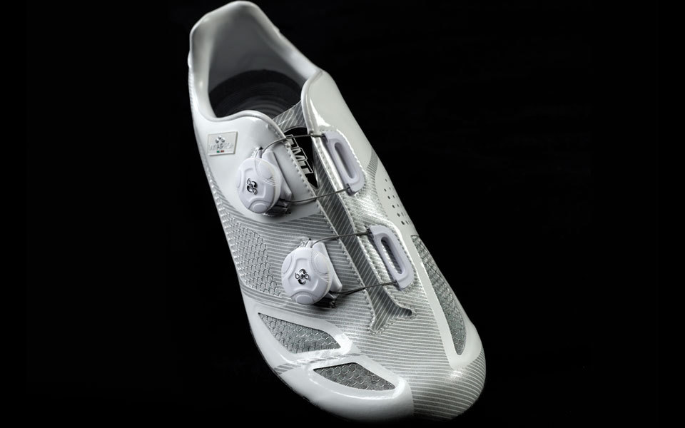
Bontrager shoes:
 Contador is the Greatest0
 -
Check out this stem...

Custom helmet:

Cadre : Canyon Speedmax CF 9.0
Fourche : Canyon Aero Fork CF
Pédalier : Shimano Dura Ace Di2 11v
Dérailleur avant : Shimano Dura Ace Di2 11v
Dérailleur arrière : Shimano Dura Ace Di2 11v
Manettes : Shimano Dura Ace Di2 11v
Freins : Shimano Dura Ace Di2 11v
Roues : Mavic Cosmic, Comete
Boyaux : Mavic Yksion Pro SSC
Potence : Intégrée
Cintre : Canyon Aero Stem Tri/TT
Selle : Selle Italia Team Edition
Tige de selle : Canyon VCLS Aero Post
Pédales : Shimano Dura Ace
Aussie Nat Champ kit + monstrous helmet:
Lotto kit really stands out and the 'lotto' on the shorts is super: Contador is the Greatest0
 -
Barguil. Kit and bike just looks fantastic.


 Contador is the Greatest0
 -
 Contador is the Greatest0
 -
Art Vandelay wrote:Nice blog post comparing the 2014 kits with last season's:
http://speedmetalpodcast.blogspot.co.uk/2014/01/2014-vs-2013-kits.html
The guy who does this blog is the brother of the Cycling Inquisitions blogger.
Thanks.Contador is the Greatest0 -
frenchfighter wrote:Check out this stem...

That is actually freaking me out a little it is all wrong on the eyes. I keep wanting to yell "your stem's broken Marianne!"
As for the Lotto kit. Agreed it looks really good. It's amazing that there has been so little red in the peloton of late. I can't remember the last time there was a red kit. Someone'll rustle one up from 2 years ago now... But it's nice to have something on that colour spectrum now we have lost the carrots.Correlation is not causation.0 -
Kingstonian wrote:Crankbrother wrote:TMR wrote:
Using the term 'gay' in a derogatory sense (and compounding it with a 'sadface') isn't really acceptable, is it?
Well said.
Generally you're correct, but I think there may be an exception for sleeveless lycra.“New York has the haircuts, London has the trousers, but Belfast has the reason!0 -
I like the colours of Giant - but it's a bit boring. A bigger wraparound logo like Lotto could have been interesting - and easier to see too.I'm left handed, if that matters.0
-
k-dog wrote:I like the colours of Giant - but it's a bit boring. A bigger wraparound logo like Lotto could have been interesting - and easier to see too.
Given they had short notice for actually being the sponsors, I reckon they did a great job but we will see improvements next year.Contador is the Greatest0 -
frenchfighter wrote:k-dog wrote:I like the colours of Giant - but it's a bit boring. A bigger wraparound logo like Lotto could have been interesting - and easier to see too.
Given they had short notice for actually being the sponsors, I reckon they did a great job but we will see improvements next year.
I agree, kit & bike look sweet together0 -
frenchfighter wrote:

Yes.frenchfighter wrote:Aussie Nat Champ kit + monstrous helmet:
Hmm, not so keen on it in that photo. 0
0


