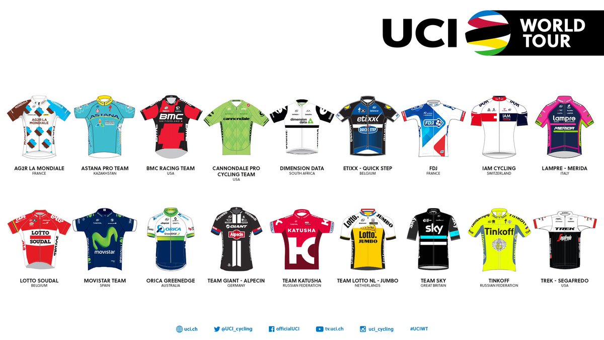
2016 Team Kit - Warning - May contain Tinkoff
Comments
-
although I really don't want to see another black kit, it did look better than the white.Dimension Data will be formally introducing their new team kit on Jan 15, so we'll see if it's black or white....
Hopefully they will go for both and do the stripes again, at least they were distinctive, even if it did make them look like American football refs 0
0 -
Dimension Data will be formally introducing their new team kit on Jan 15, so we'll see if it's black or white....
I'm with Michael Jackson on this. It doesn't matter."In many ways, my story was that of a raging, Christ-like figure who hauled himself off the cross, looked up at the Romans with blood in his eyes and said 'My turn, sock cookers'"
@gietvangent0 -
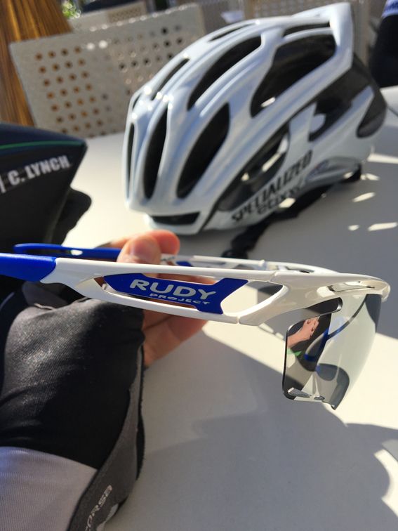
They don't have to wear Rudy specs, just like they don't have to wear [insert shoe brand]. I recon plenty of them will still be wearing Oakleys. Dan Martin was never out of his even when Garmin or Cannondale were using POC.
Here you go. A pic of Dan Martin's actual glasses!
Told me it wasn't worth sticking with Oakley as they don't give him enough and it wasn't worth pissing off the rest of the team to stick with them.0 -
They look awful. I'd rather wear a pair of POCs!0
-
The Sky kit looks awfully shiny in the photos they put up online today.0
-
The Sky kit looks awfully shiny in the photos they put up online today.
It looks a bloody mess. I cannot understand the love for it... Kwia already falls a notch in the style stakes. 0
0 -
The Sky kit looks awfully shiny in the photos they put up online today.
It looks a bloody mess. I cannot understand the love for it... Kwia already falls a notch in the style stakes.
Yes, it does. I liked the idea of the top but altogether it doesn't seem to work well.
He doesn't look as slim as Vayer was claiming the other day.0 -
Dimension kit is easy to spot from a helicopter shot - it might be black but it's got a big fluorescent green Q on the back


 0
0 -
Dimension kit is easy to spot from a helicopter shot - it might be black but it's got a big fluorescent green Q on the back


I thought it was movistar at a glance, but I'll get used to it.0 -
It's funny how people complain about all the black kit................(even now that Etixx have gone dark)
 0
0 -
That Ettix kit is hummin' man!
And I really like the Tinkoff kit
This is pretty much role reversal from last year for me.0 -
Looking at them alongside each other I am a bit meh to IAM now.0
-
That Ettix kit is hummin' man! .
I thought the same at first but sometimes it looks quite good 0
0 -
The Lidl logo isn't exacty a thing of beauty, the rest i find OK.
 0
0 -
That Ettix kit is hummin' man! .
I thought the same at first but sometimes it looks quite good
You mean it looks good when Tommeke wears it?We're in danger of confusing passion with incompetence
- @ddraver0 -
I'm starting to warm to it a bit more. The LIDL logos look rubbish though. It's the placement of them, like they've been pinned on afterwards as someone forgot to design them in. If they weren't on the slant I think they would be a bit less bluuurgh and the white border makes it look even worse.0
-
You mean it looks good when Tommeke wears it?
Well, Tom is very easy on the eye0 -
The only person Ive ever seen pull off Double Denim!
or single denim 0
0 -
That Ettix kit is hummin' man! .
I thought the same at first but sometimes it looks quite good
Maybe I'll warm to it throughout the year but I can't see it at the moment.
Each to their own n'all that.0 -
That Ettix kit is hummin' man! .
I thought the same at first but sometimes it looks quite good
That's me. Right above Tom's shoulder (in green with black helmet). 0
0 -
I actually think the placement of the Lidl crest is deliberate and good.
If you have them flat across the shoulders they can crumple and not be read.
Sky have spent years experimenting with the placement and angle of their shoulder logos.
I should go out a bit more, shouldn't I?0 -
I actually think the placement of the Lidl crest is deliberate and good.
If you have them flat across the shoulders they can crumple and not be read.
Sky have spent years experimenting with the placement and angle of their shoulder logos.
I should go out a bit more, shouldn't I?
I hear you... we spend too much time assessing kit as it looks off the bike rather than how things look once on the bike...0 -
Wow. I was expecting a load of grief for nurdiness
 0
0 -
saving yourself for a devastating attack?
Not allowed to move up and ruin the photos 0
0 -
That Ettix kit is hummin' man! .
I thought the same at first but sometimes it looks quite good
Nobody commenting on the black shoes.
Which I approve of btwIt's a little like wrestling a gorilla. You don't quit when you're tired. You quit when the gorilla is tired.0 -
The shoes fit with the rest of the kit and the bike so they sort of make sense to me. Still think white looks better, as with the guys in the background with no leg warmers0
-
Ag2R bluer than last year

 0
0 -
As the sole supported of The Brown, I am disappoint
 Team My Man 2018: David gaudu, Pierre Latour, Romain Bardet, Thibaut pinot, Alexandre Geniez, Florian Senechal, Warren Barguil, Benoit Cosnefroy0


