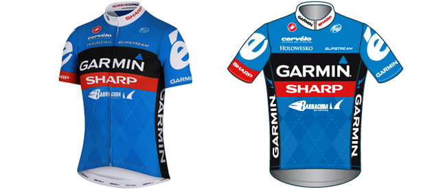
Garmin Sharp Barracuda Kit
Comments
-
Not sure what else they could have done really....Garmin is blue/black and Sharp is Red, it was never going to work!
In a similar vein, whoever has to design Tim Duggan's Liquigas green/white vs Red/Blue US champs jersey is going to have a hell of a time!!
However, there might be some cheap Castelli shorts available soon if you can handle the old kit. It's ok to wear it now as it's "classic" so jersey w*nkers won't complain (should that bother you, which it shouldn't)We're in danger of confusing passion with incompetence
- @ddraver0 -
It's OK, think I like it as much as the previous one. I have just bought the Barracuda jersey for my forthcoming 2012 TdF Extravaganza (to match my bike, gotta look the part, right?), but what do I do now? Return the one I have to Wiggle (haven't worn it yet) and try and pick up one of the new ones whilst I'm over at the Tour? *Sigh* More decisions!0
-
It's the Argyle I hate. Really wish they'd lose it. If they got rid of the blue as well and went with a black or white background that would be an epic jersey, reminiscent of the 2009 - 2010 designs.0
-
The Mad Rapper wrote:It's the Argyle I hate. Really wish they'd lose it. If they got rid of the blue as well and went with a black or white background that would be an epic jersey, reminiscent of the 2009 - 2010 designs.
That won't happen though, Vaughters likes it!
(So do I, almost bought the socks to match...)0 -
greasedscotsman wrote:That won't happen though, Vaughters likes it!
To be fair, Vaughters dresses like Rupert the Bear, so I'm not sure he's best placed to judge 0
0 -
The Mad Rapper wrote:greasedscotsman wrote:That won't happen though, Vaughters likes it!
To be fair, Vaughters dresses like Rupert the Bear, so I'm not sure he's best placed to judge
So you didn't like VdV's pants then? 0
0 -
I like the Argyle, would maybe prefer it to be a bigger feature, it's distinctive. IMO a good pro jersey should be easy to spot, not look like a leaders jersey, and finally, possibly, be attractive enough to want to own.You live and learn. At any rate, you live0
-
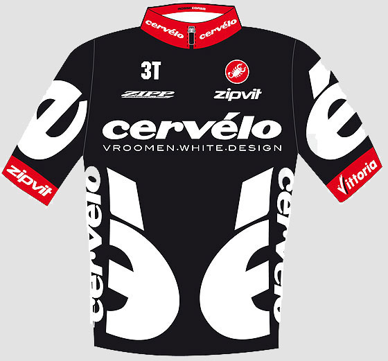
I also like the Argyle. I liked the old white / blue / orange Garmin kit, they could have replicated that with red in place of orange. As it is, they've come up with something which - dare I say it, and whisper it quietly - looks a bit like USPS...0
-
Jez mon wrote:I like the Argyle, would maybe prefer it to be a bigger feature, it's distinctive. IMO a good pro jersey should be easy to spot, not look like a leaders jersey, and finally, possibly, be attractive enough to want to own.
These are the best Cervelo jerseys IMHO - I love them both:
 0
0 -
The Mad Rapper wrote:ddraver wrote:Well, yeah, but they werent Garmin then...
I know, but the teams went on to merge so it would have been nice to have seen them keep more of the Cervelo approach to jersey design.
They have though, haven't they? The big "é" logos on the shoulders and back are still there.0 -
Interesting. The Red doesnt tie in (red is not a good colour generally) and so the kit looks less stylish. It looks like they merged the kit with the cervelo kit.Contador is the Greatest0
-
greasedscotsman wrote:They have though, haven't they? The big "é" logos on the shoulders and back are still there.
Sorry, I meant the colour scheme not logos.0 -
ddraver wrote:However, there might be some cheap Castelli shorts available soon if you can handle the old kit. It's ok to wear it now as it's "classic" so jersey w*nkers won't complain (should that bother you, which it shouldn't)

My thoughts as well. I await Probikekit to reduce it.0 -
I'm on the fence, the old Cervelo Test Team and Garmin Cervelo kits were awesome, the new Garmin one grew on me and I now love it, so I will give this red dash time. It's not horrid and it's distinctive in the peleton.
Be interesting to see next years kit when the Sharp aspect can be fully consider in a design from scratch.0 -
Reminds me of a de Nardi kit from 04. Unispiring but not offensive.It's a little like wrestling a gorilla. You don't quit when you're tired. You quit when the gorilla is tired.0
-
Full view:
 0
0 -
Not bad. I like the blue.
I also like the blue of the Saxo Bank kit, probably more than the riders like riding for the team0 -
 0
0 -
That is a nice kit.
My club kit (Ellan Vannin) is predominantly blue and white. Perhaps we are witnessing a move to blue from green in the Peleton?0 -
-
ddraver wrote:In a similar vein, whoever has to design Tim Duggan's Liquigas green/white vs Red/Blue US champs jersey is going to have a hell of a time!!
Dave, you mean a bit like this
how was the rough place the other night wearing your orange? 0
0 -
LOLContador is the Greatest0
-
Ryder's custom Cervelo looks amazing
 0
0 -
brettjmcc wrote:ddraver wrote:In a similar vein, whoever has to design Tim Duggan's Liquigas green/white vs Red/Blue US champs jersey is going to have a hell of a time!!
Dave, you mean a bit like this
how was the rough place the other night wearing your orange?
Oh that is rank!!! Hee hee, poor bloke! I'm sure the pride of wearing it will outdo how bad it looks!
Yeah, I got out, It appears that it is not cool to wear orange in Holland unless the football is on...? Seriously got more funny looks in an hour than a few of us dressed up doing a "monopoly pub crawl" did all day! The Burgerz (sic) I was waiting for was flipping awesome though so I didnt mind. Shame the Germans could nt have won but then fair play to Italy, they were brilliant!We're in danger of confusing passion with incompetence
- @ddraver0


