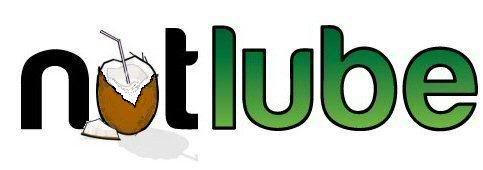
soooo.... you like?
Comments
-
The first logo doesn't look that good, keep the font, you're on the right track with the cocunut placing but as someone said it looks like not lube, maybe use smaller coconuts to make up the letter U or something. or change the font to look like actual coconuts.0
-
The original looks crap.0
-
The original looks crap.0
-
change the nam,e of nutlube to sheepsteeth then use a picture of kevin websters face on the bottle. sorted.0
-
-
The spacing's definately not right, when you scale it down the l, u and b are too indistinct. It's legible but less eyecatching. It doesn't look quite right at full size either because of the illusion of a difference between the sets of round and square letters. Very simple to throw a few extra points between the l u and b though and that'll sort it. Haven't got the font to mock it up myself but I think it'll probably look pretty nice once you sort that, it's a good choice of shapes and colours and pretty strong.Uncompromising extremist0
-
-
sheepsteeth wrote:change the name of nutlube to sheepsteeth then use a picture of kevin websters face on the bottle. sorted.

I think the original looks good, was going to suggest trying it in capitals, and have the 'T' of nut as a coconut tree, but I'm not sure that would look good scaled down, as 360 mentioned (I'm sh!t at photoshop etc, so won't bother trying)!
Gaz's effort looks good as well, but in that particular guise, I agree with Yeehaa, it does look a bit like 'notlube'.
Muc off doesn't have a particularly eye catching logo (although the pink does make it stand out), and look at the sales of that. Specializeds big red S isn't all blingy and in your face either.. in both cases, the product works, therefore sells. Granted, first impressions go a long way, but word of mouth, providing your product is as good as you say it is also goes a very long way too.
If you need sales reps and like to pay very well, give me a shout buddy

Oh, and do we get commission for helping you choose your logo? 0
0 -
And you're old than me still... whats your excuse?0
-
Touche
 0
0 -
Right given that its 4am, here we go, a bit more fettling, more could be done too

Less like an O now. I agree with the comments about word of mouth, but my personal opinion is treat the customers like retards initially, spell it out to them what your product is, what it does and what its about. Green font definately does that with regards to the ecological aspect of it. If it sells well and word of mouth begins to account for more then you can make the image more grown up through restyling, but first of all get the product into the conscience, then you get the snowball effect of recommendations0 -
Still looks like Notlube, always will, sorry but no amount of tweaking will change that, you're sticking an o shaped object in a u shaped hole. You could get away with it on a househole name but it's not going to work here without a complete rethink.
I would say personally, keep it with just the name. Cleverness looks good on a bit of university coursework but what works on an actual product is boldness, easy comprehension and easy recognition. And the name's not ideal from that point of view already * so don't water it down further.
(* in that you don't look at it and think "Oh, chain lube" or even "bike lube" you think "Hmm, nonspecific lube of some description" or worse "Some sort of antisieze for nuts and bolts". There's no obvious mental connection from nuts to bikes never mind chains. That's not a major issue but it means you can't afford to lose any more clarity)
Or so I reckon anyway, though I'm very out of practice.Uncompromising extremist0 -
 Vitus Sentier VR+ (2018) GT Grade AL 105 (2016)
Giant Anthem X4 (2010) GT Avalanche 1.0 (2010)
Kingley Vale and QECP Trail Collective - QECP Trail Building0 -
when can I buy some, then?Vitus Sentier VR+ (2018) GT Grade AL 105 (2016)
Giant Anthem X4 (2010) GT Avalanche 1.0 (2010)
Kingley Vale and QECP Trail Collective - QECP Trail Building0 -
I still think he should have gone with "Coco Chainoile", but that's because I am a certified genius, and the rest of the world is retarded.0
-
yeehaamcgee wrote:I still think he should have gone with "Coco Chainoile", but that's because I am a certified genius, and the rest of the world is retarded.
I like that, or Chainoil number 5 from coco chainoil (keeping coco chainoil then as the brand) I like more, but either give you a simple logo layout, a name people listen to, it disassociates the product from being for bike nuts, and the Chanel logo is easy to turn into coconuts or chainlinks.
Liking your work there yeehaa and I think it's far easier proposition to market0 -
It was suggested AGES ago.0
-
To be fair I didn't pay much attention when the idea was first banded about, otherwise I'd have supported this idea. Anyway I shall be supporting this idea in my sleep, early start night night0
-

Best I could do... looks more like a U now, even when it is tinyVitus Sentier VR+ (2018) GT Grade AL 105 (2016)
Giant Anthem X4 (2010) GT Avalanche 1.0 (2010)
Kingley Vale and QECP Trail Collective - QECP Trail Building0

