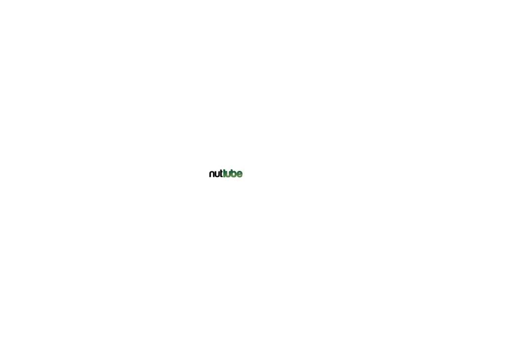
soooo.... you like?
joshtp
Posts: 3,966

any thoughts?
I like it... simple, clean, and suits the look we'r going for.
what do ya think?
I like bikes and stuff
0
Comments
-
needs more testicals
oh wait it's the chain lube, yeah thats cool0 -
-
That font sucks donkey balls. It'll look shit if it's shrunk too.
I presume you did this in paint?0 -
joshtp wrote:your a 'tard.
It actually looks pretty good shrunk...
It was done in Adobe Illustrator, by a skilled graphic designer.
Since I don't like your silly logo im an idiot? Don't post it if you can't take a little critiscism.
Like it or not, that will not scale well, the spacings attrocious. Clearly its amateur hour at your graphic designers house.0 -
360 wrote:joshtp wrote:your a 'tard.
It actually looks pretty good shrunk...
It was done in Adobe Illustrator, by a skilled graphic designer.
Since I don't like your silly logo im an idiot? Don't post it if you can't take a little critiscism.
Like it or not, that will not scale well, the spacings attrocious. Clearly its amateur hour at your graphic designers house.
just out of interest, are you a graphic designer?
if yes, maybe give him some pointers. if no, how do you know so much to be listened to?
 0
0 -
The font is good, but it needs something else , perhaps a logo thats relevant to it above, that draws the eye, think animal logo.
as it stands its just lettering and while nice lettering doesn't bring you in, perhaps change one of the letters to something relevant
heres an example, the Hombres logo I designed so the O became the old doodle kids did at school of a mexican on a bike (not the best quality logo I have but you get the idea) so whilst simple lettering it also has something that draws the eye
My other reservation is the name itself could be misconstrued as a lubricant to use on nuts and bolts, like a penetrating oil, rather than as relevant to your coconut formula, perhaps use of a coconut in your logo would clear that up?
I think your enterprise and idea is ingenious by the way and I hope you dont see me as ripping this to shreds, just hoping this is practical advice0 -
it's fine, colour combo , font, etc.....except the T of nut needs sorting, it's horrific looking and has no width. brings the whole design down to amatuerish.
In fact, I'm sure there are better rounded type fonts available that do the job better. But the overall look is good.0 -
Gazlar wrote:The font is good, but it needs something else , perhaps a logo thats relevant to it above, that draws the eye, think animal logo.
as it stands its just lettering and while nice lettering doesn't bring you in, perhaps change one of the letters to something relevant
heres an example, the Hombres logo I designed so the O became the old doodle kids did at school of a mexican on a bike (not the best quality logo I have but you get the idea) so whilst simple lettering it also has something that draws the eye
My other reservation is the name itself could be misconstrued as a lubricant to use on nuts and bolts, like a penetrating oil, rather than as relevant to your coconut formula, perhaps use of a coconut in your logo would clear that up?
I think your enterprise and idea is ingenious by the way and I hope you dont see me as ripping this to shreds, just hoping this is practical advice
thanks for that Gaz'... really useful advice that.... We did experiment with all sorts of stuff like coconuts and tree's and the like... but in the end none if it ever really looked right, and we decided that just lettering would be good.
It's not finalized yet, id quite like to make the green a little more vibrant, and I'll think some more about a symbol or something.
As for the purpose, well, the bottle will say it's purpose obviously, and it will be advertised clearly as a chain lube... I cant really see how else you can make it any clearer... I mean Rock and Roll isn't for guitars... and Green oil can be used on bikes of all colours, and Muc off dry isn't for cleaning dry dirt off....
keep the (constructive) idea's coming all! thanks!
oh, and 360:
It does scale well.... this is WAY smaller than it will ever need to be, and don't forget things look way different printed to on a screen... but here it is really small: I like bikes and stuff0
 -
Like it - neat and simple, if a little conventional.
If it will always be on a white background, all good.
If not, you might
a) brighten the green a bit - maybe even go a bit flourescent - so that it doesn't get 'lost' against dark backgrounds, and
b) put a (white?) border around the black lettering (might be there already, can't see) so that it doesn't vanish on a black background. Of course this will only matter if you make stickers / labels with the lettering on a transparent backing.
Just had another thought . . . try rotating the word 'nut' 90 degr counterclockwise and sizing it in to lie alongside the letter l of lube. You could then spin your label through a range of 90 degrees without affecting legibility (eg: sticker on a frame, or lengthwise on a can/bottle of goo)
Good luck - hope it all goes well My abundant supply of MTFU is reserved for use in dry, sunny conditions.0
 -
thanks Delta5... some nice idea's there...I like bikes and stuff0
-
360 wrote:the spacings atrocious.
While I wouldn't quite go that far, there definitely is something a miss with it, looking at your avatar with the smaller version the "lub" looks a bit too squeezed in for me, possibly that should include the t as well. Looks fine in the big size but small size looks odd.
Also i'm not so comfortable with the roundness of the letters, the b especially looks odd to me.
I do like how the top of the t l and b round off at the top, though that rounded off bit is the wrong way round on the Us, should be on the other leg of the U but on the inside side? (does that make sense)
I'm no graphic designer or owt, it's all just my own opinion, feel free to ignore it (well except about the Us that's starting to annoy me now i've noticed it!)
EDIT: Following on from Gazlars point about images, You could use a coconut tree as the T in nut, may look super cheesy though! :?"I have a plan, a plan so cunning you could stick a tail on it and call it a fox." (from the Blackadder TV series)0 -
anton1r wrote:360 wrote:the spacings atrocious.
While I wouldn't quite go that far, there definitely is something a miss with it, looking at your avatar with the smaller version the "lub" looks a bit too squeezed in for me, possibly that should include the t as well. Looks fine in the big size but small size looks odd.
Also i'm not so comfortable with the roundness of the letters, the b especially looks odd to me.
I do like how the top of the t l and b round off at the top, though that rounded off bit is the wrong way round on the Us, should be on the other leg of the U but on the inside side? (does that make sense)
I'm no graphic designer or owt, it's all just my own opinion, feel free to ignore it (well except about the Us that's starting to annoy me now i've noticed it!)
good points... now you'v pointed out that U... It's really bugging me! Might have to change it!
And it's worth pointing out that my Avatar is a strange compressed version, that's squished lengthwise... look at the second pic I uploaded to see how it really looks small.I like bikes and stuff0 -
joshtp wrote:And it's worth pointing out that my Avatar is a strange compressed version, that's squished lengthwise... look at the second pic I uploaded to see how it really looks small.
noted: I started typing my response before you put that up. Yeah it does look better in the small non avatar version."I have a plan, a plan so cunning you could stick a tail on it and call it a fox." (from the Blackadder TV series)0 -
joshtp wrote:
As for the purpose, well, the bottle will say it's purpose obviously, and it will be advertised clearly as a chain lube... I cant really see how else you can make it any clearer... I mean Rock and Roll isn't for guitars... and Green oil can be used on bikes of all colours, and Muc off dry isn't for cleaning dry dirt off....
]
No granted that, but they are also detatched in language from anthing else, eg you dont have a green that needs lubing on a bike, if you catch me drift. It can be overcome with clear labelling, which makes nutlube your brand then. Another suggestion and please feel free to rubbish this as it is just advice that you may or may not like is to give it a name, Mr Coco's nut lube etc ( thats just off the top of my head, in the same kind of way as Mr Zogs sexwax?
anyway I had a fiddle with your logo as an idea quickly, obviously sizing/spacing are out
The nut would be taller, spacing sorted etc0 -
I have the artistic and style sense of a blind retarded child, so I couldn't care less how a logo looks, as long as the product's good.0
-
Gazlar wrote:joshtp wrote:
As for the purpose, well, the bottle will say it's purpose obviously, and it will be advertised clearly as a chain lube... I cant really see how else you can make it any clearer... I mean Rock and Roll isn't for guitars... and Green oil can be used on bikes of all colours, and Muc off dry isn't for cleaning dry dirt off....
]
No granted that, but they are also detatched in language from anthing else, eg you dont have a green that needs lubing on a bike, if you catch me drift. It can be overcome with clear labelling, which makes nutlube your brand then. Another suggestion and please feel free to rubbish this as it is just advice that you may or may not like is to give it a name, Mr Coco's nut lube etc ( thats just off the top of my head, in the same kind of way as Mr Zogs sexwax?
anyway I had a fiddle with your logo as an idea quickly, obviously sizing/spacing are out
The nut would be taller, spacing sorted etc
Hmmm, Thats pretty good actually...
I'm definitely gonna have to think about all this stuff... problem is I'v been "thinking about it" for like a month now.... Gotta make a decision sooner or later....
working on finding a better font at the mo, then I'll try and get a symbol in...I like bikes and stuff0 -
Looking a bit more, I do really like that coconut... it seems to fit better than any of the coconut's we'v put in ever have....
I'v just found this font, what's the thoughts? I like bikes and stuff0
 -
or even this... need's colours and stuff... just typed it into the font preview on the font site....
http://www.1001freefonts.com/image.php? ... nt=KubrickI like bikes and stuff0 -
definately not the last one, I prefer the 1st of the three TBH. And just reread my last post, I meant whatever you do don't go down the Mr Zogs route lol0
-
i prefer the original personally, the thing is with posting things on here is that you can't please everyone. go with what you think and hopefully the product will speak for itself
 0
0 -
yeehaamcgee wrote:
Love the thinking, but that mockup does look like "Not Lube"Gazlar wrote:anyway I had a fiddle with your logo as an idea quickly, obviously sizing/spacing are out
The nut would be taller, spacing sorted etc
Yeah I threw it together, bit of height to the cocnut woul soon sort that
Anyway I'm off shoplifting now
Catch yaz all laters0 -
welshkev wrote:just out of interest, are you a graphic designer?
if yes, maybe give him some pointers. if no, how do you know so much to be listened to?

No, i'm not.
I just spend alot of money with them. We commision a fair bit of packaging design and lots of ad work. Having a scaleable logo is extremely important. You want something that will look good on a 10ft banner and on a matchbox. I dont think that will.
As I say im not a designer, I can't tell you how to make it better but can tell you why we wouldn't use it.0 -
360 wrote:welshkev wrote:just out of interest, are you a graphic designer?
if yes, maybe give him some pointers. if no, how do you know so much to be listened to?

No, i'm not.
I just spend alot of money with them. We commision a fair bit of packaging design and lots of ad work. Having a scaleable logo is extremely important. You want something that will look good on a 10ft banner and on a matchbox. I dont think that will.
As I say im not a designer, I can't tell you how to make it better but can tell you why we wouldn't use it.
that's cool, it's just you were harsh, offering no constructive advice. just that it was poo 0
0 -
anton1r wrote:360 wrote:the spacings atrocious.
While I wouldn't quite go that far, there definitely is something a miss with it, looking at your avatar with the smaller version the "lub" looks a bit too squeezed in for me, possibly that should include the t as well. Looks fine in the big size but small size looks odd.
Also i'm not so comfortable with the roundness of the letters, the b especially looks odd to me.
I do like how the top of the t l and b round off at the top, though that rounded off bit is the wrong way round on the Us, should be on the other leg of the U but on the inside side? (does that make sense)
I'm no graphic designer or owt, it's all just my own opinion, feel free to ignore it (well except about the Us that's starting to annoy me now i've noticed it!)
EDIT: Following on from Gazlars point about images, You could use a coconut tree as the T in nut, may look super cheesy though! :?
Thanks for illustrating my point. I do admit I might have been a bit short...0 -
that original font is not a million miles off, if i get me head on later i'll remember the font I've seen like that but slightly better.0
-
I like the orginal, perhaps in 3D ??
Another thought would be actually using a nut on a threaded shaft that wold make the letter " t " this the depicts an engineering image rather than stuff you rub on your balls !!
Keep up the good work0

