Storck Fenomalist (Should the wheel decals be removed?)
Bon_Jovi
Posts: 18
I definitely need better pictures - she looks a lot better in person! (bet you've heard that before)

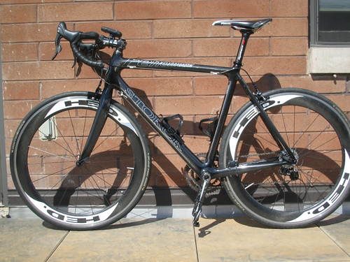


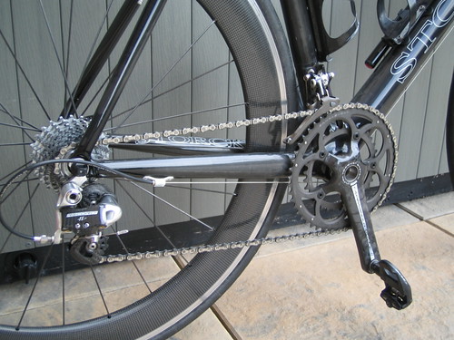
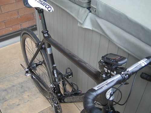
No more HED decals. I think it looks better. Thanks for the suggestions.


No more HED decals. I think it looks better. Thanks for the suggestions.
0
Comments
-
I'm not really into removing stickers from wheels, but I think this would be a good choice here.
Beautiful non the less!
What's the seatpost?0 -
Nice bike...
 Find your limits...and then exceed them frequently0
 -
Seatpost is a Syntace P6. It is truly an awesome post, with a "flippable" head. Works to give you setback if you need, or push you forward if you like to slam your seat forward.
I've definitely thought about removing the wheel stickers. One of the stickers? Both of them? Thoughts?0 -
All of them. Nice. Never seen one on the road.0
-
Why not remove the decals and replace with just the HED. logo as just a thin outline like the Frame decals?!? :shock:
That would be more subtle and balance the entire look (which is really nice) like the two tone saddle 8)Up: Wilier Mortirolo
Down: Orange Patriot0 -
leejdavies wrote:Why not remove the decals and replace with just the HED. logo as just a thin outline like the Frame decals?!? :shock:
That would be more subtle and balance the entire look (which is really nice) like the two tone saddle 8)
+1, nice idea Lee.0 -
looks better now its not a moving hed advert.0

