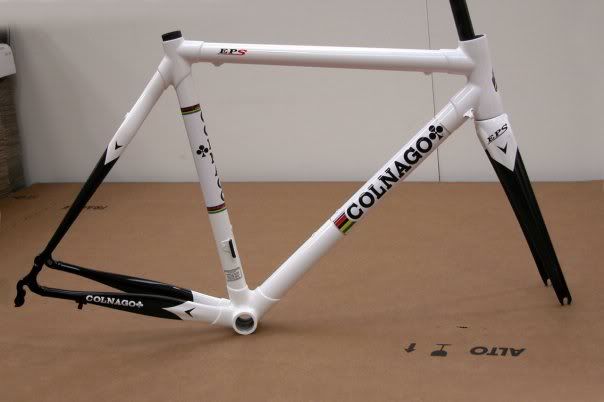
Great colour scheme - Colnago EPS
nicensleazy
Posts: 2,310
My friend has just placed an order for the below EPS.....great colour scheme !


0
Comments
-
Are you serious? Its black and white FFS!More problems but still living....0
-
Yes, its simplistic. Lovely pearl white over black naked carbon.....you obvoiusly don't get it! :roll:0
-
nicensleazy wrote:Yes, its simplistic. Lovely pearl white over black naked carbon.....you obvoiusly don't get it! :roll:
Neither do I.
It's very easy to say "you don't get it" when somebody doesn't agree with your taste, but it's meanigless. Beauty is in the eye of the beholder. You like it, which is great. However I doubt many people would see it as any more than an ordinary paintjob.
The choice of "colour" is uninspired, the design is clunky and more than a little fussy in places. 4/10. Must try harder. In all fairness a bicyle frame is a different thing to paint in new and interesting ways, I can't think of any designs I've seen which I would consider inspiring. The one thing that will improve almost any design is removing the decals and stripes, something this design has in spades.0 -
black and white, perfect combination for bikes, football strips and stranglers albums, especially if you got the free single.
Walk on by0 -
Nice - not quite as classy as white panels on solid colour IMOMake mine an Italian, with Campagnolo on the side..0
-
I bet no-one would be saying it was special if it was a Boardman or a Claud Butler.
Just another post by nicensleazy telling us about silly expencive tat :shock:More problems but still living....0 -
amaferanga wrote:I bet no-one would be saying it was special if it was a Boardman or a Claud Butler.
Just another post by nicensleazy telling us about silly expencive tat :shock: 0
0 -
i just thought he was sneaking in a new Stranglers thread, outside of Cake Stop0
-
wiffachip wrote:i just thought he was sneaking in a new Stranglers thread, outside of Cake Stop
you know me too well!


 0
0 -
"something this design has in spades"
Clubs, actually.0 -
I have to agree - 'eye of the the beholder' and all that,
but not very inspiring, if paint shops can do it, why can't the major manufacturers?
http://www.velocolour.com/gallery-2010-01/index.html
anyone remember the Kleins from the 90's/00's before Trek got hold of them?
http://images.google.co.uk/imgres?imgur ... s%3Disch:1If Wales was flattened out, it'd be bigger than England!
Planet X Ti Sportive for Sportives & tours
Orange Alpine 160 for Afan,Alps & dodging trees
Singlespeed Planet X Kaffenback for dodging potholes
An On-One Inbred for hard-tail shenanigans...0 -
He's a very naughty boy!!..................
 "There's a shortage of perfect breasts in this world, t'would be a pity to damage yours."0
 -
7GarethPJ wrote:nicensleazy wrote:The one thing that will improve almost any design is removing the decals and stripes, something this design has in spades.
Hehe. I agree, it's ridiculous machismo styling and I hate it. I call it Power Ranger Syndrome. Lots of things suffer from it - mobile phones, some cars, most motorcycles, most bicycles, even razors.
I think it would be better with just the seattube and a smaller downtube sticker. I'm not a fan of the lugs at all. It's not nearly as bad looking as most racing bikes though.0

