RadioShack Kit


Comments
-
grey? Have they not learned the lesson of the famed Man U third kit from however many years ago it was?
other than that, it's not bad for a pro kit. I also quite like the livestrong armband design... wonder if that'll just be on lance's kit or on all of them?point your handlebars towards the heavens and sweat like you're in hell0 -
I quite like it, although I don't go for team jerseys really. Closest I came was USPS but they changed to Discovery before I got one!0
-
fairly dull but harmless. Better than expected for someone with sufficient lack of style to wear black socks...0
-
Do you think they'll get him a jersey that fits before the season starts?0
-
patchy wrote:I also quite like the livestrong armband design... wonder if that'll just be on lance's kit or on all of them?
If that jersey was Lance's specific one it'd have world champ bands on it too. So I'm guessing the whole team'll get the Livestrong bandScottish and British...and a bit French0 -
Where's Frenchfighter to slaughter the design??????0
-
andyp wrote:Do you think they'll get him a jersey that fits before the season starts?
From the e-mail received this morning:-
The experts at Nike and our partners at RadioShack helped to create this fast form-fitting design using various textures and patterns symbolizing the themes of new technology, global connectivity and community. :shock: :roll:0 -
Colours & patterning seem derivative of Caisse d'Epargne, but maybe that's to sow a bit of confusion in the peloton. The yellow band is a distraction.0
-
It's hideous.. yuck.... and boring..0
-
PinkBianchi wrote:It's hideous.. yuck.... and boring..
Just out of curiosity. Why HIDEOUS????? Yet you call yourself "PinkBianchi". Somethings not right here.0 -
Not bad but not great. Can't get past the strapless dress comment!0
-
Meh. It'll look too much like Caisse d'Epargne when it's in the middle of the peloton. CdE looks nicer, though.
Also, does this mean the team is not called The Shack? What happened to the rebranding?0 -
I quite like it. Red goes nice with the grey and that little bit of yellow just sets it off...I'm off now, I've got lunch with Gok Wan :oops:There is never redemption, any fool can regret yesterday...
Be Pure! Be Vigilant! Behave!0 -
afx237vi wrote:
Also, does this mean the team is not called The Shack? What happened to the rebranding?
Looks like "The Shack" is written down the side panels.
A fairly drab design IMO but then i'm sure we'll be seeing plenty of the jersey in magazines and on TV and on the internerd anyway so I guess it doesn't matter too much.Let's close our eyes and see what happens0 -
The grey symbolises age and the red, blood.
Who says Lance hasn't got a sense of humour? :P"Science is a tool for cheaters". An anonymous French PE teacher.0 -
Beautiful. As the web page loaded I was stunned with amazement that anyone could design, at last, a good looking jersy. One could say it’s close to what the experts would call “art”.
It had to be Lance. x-x-x-x-x-x-x-x
Commuting / Winter rides - Jamis Renegade Expert
Pootling / Offroad - All-City Macho Man Disc
Fast rides Cannondale SuperSix Ultegra0 -
gabriel959 wrote:Beautiful. As the web page loaded I was stunned with amazement that anyone could design, at last, a good looking jersy. One could say it’s close to what the experts would call “art”.
It had to be Lance.
I don't know art Gabriel but I know what I like and I like it 8)0 -
It made me laugh when someone suggested he should centre the R!

Oh yes, we'll just change our main sponsors logo cos we don't like it!
I thought all Lance follows were yes men, it was great to see quite a few of the early posters writing they don't like it.0 -
No comment on the jersey - but he looks quite slim in it. Certainly seems to have lost all of the beef he was carrying at this time last year. Looks slimmer even than post-Tour.0
-
its no less offensive than many of the protour jerseys. It cant be worse than Garmins 2009 Argle kit.
I would be pissed if i was at Nissan. Grey logo on a grey backround. Might as well have not bothered unless the veiwer has HD and likes extreme closeups.0 -
Incredibly dull. Not the worst jersey I've seen, but close.0
-
If you think this is bad have a look at the photos of their bikes.Contador is the Greatest0
-
frenchfighter wrote:If you think this is bad have a look at the photos of their bikes.
Does anyone else think ff's opinion could be a bit biased due to his(how shall I say it?),
unflattering view of LA?
It was really quite unnecessary for you to actually post ff. We ALL knew what you would say. Nothing happening here folks - move on.0 -
Nothing too offensive. Looks kinda like a wetsuit.
I assume the bikes are grey and black Madones.It's a little like wrestling a gorilla. You don't quit when you're tired. You quit when the gorilla is tired.0 -
Does anyone else think dennisn's opinion could be a bit biased due to his(how shall I say it?) unflattering view of LA?dennisn wrote:frenchfighter wrote:If you think this is bad have a look at the photos of their bikes.
Does anyone else think ff's opinion could be a bit biased due to his(how shall I say it?),
unflattering view of LA?
It was really quite unnecessary for you to actually post ff. We ALL knew what you would say. Nothing happening here folks - move on.
It was really quite unnecessary for you to actually post dennis. We ALL knew what you would say. Nothing happening here folks - move on.0 -
I think it looks neat, it reminds me of the Cilo-Aufina jersey (Swiss team from the early 1980s)maltiv wrote:Incredibly dull. Not the worst jersey I've seen, but close.
Man, have a look at this jersey: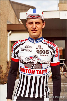
Believe me, sometimes 'dull' is just the better option.0 -
It's really not nice, is it? Hard to believe some one actually designed it. Maybe it looks much better in action, ie on the bike.0
-
Timoid. wrote:Looks kinda like a wetsuit.
Or a skinsuit. They tend to stretch tight at the neck when you stand upright, if you're wearing the right size.0 -
In terms of classic jerseys, this has to be the best one incorporating red:
http://www.flickr.com/photos/crvv/4108258433/0 -
The Tonton Tapis is Ace!!!
I forgot all about that!
I hope Prendas bring this one back!0

